Ecotricity
My current job as a UX Designer for Ecotricity has involved me co-leading UX/UI in their large-scale Salesforce E&U project, looking to overhaul their customer and B2C staff-facing software. My primary role as one of two UX designers, is bridging the gap between the industry expert’s and customers’ requirements and the development team’s constraints, by gathering information and producing Figma prototypes with both in mind. Here - along with the other UX Designer - I use my user-centred UX/UI design expertise to gather requirements and produce Lo-Fi, then Hi-Fi prototypes with an easy-to-use, clean and modern UI. These designs are then used by the external development team, to create the Salesforce platform used by Ecotricity customers and B2C staff, where I will perform final internal and external user testing to validate the final product.
As the B2C project comes to an end, the B2B project begins. The discovery phase for this project has just started, where we are leading observations, workshops and interviews to gather as much information and context as possible, to understand this new environment further and hopefully produce better designs as a result of this newfound knowledge.
The UX Tabletop Project
This was my Major Project I undertook during my MSc UX Design year. The project was essentially split into two sections: Creating a UX guide for boardgame design, then using said guide to improve a boardgame project I had previously worked on called Land Ahoy.
The project was a great opportunity for me to showcase my UX skills and knowledge, effectively translating what I had learned that year, into a guide that summarises UX design principles; with the intention of helping boardgame designers improve usability.
Active League
This project's aim was to redesign the Strava app. I did not like how the app used social media elements and simplistic extrinsic rewards to try to motivate its users to be more active. I felt that there was a much better solution through the use of better gamification elements, tapping into the potential of friendly competition.
Gamification Elements from the Fantasy Premier League game created a great environment for friendly competition and proved to be a great integration into the Strava format. The Strava app was subsequently redesigned without its social media elements, and instead was made into a points-based exercise league game. The logo and name of the app was also changed to fit this new design direction.
As seen in the final two key pages of the Active League Design Report, users found themselves much more motivated in comparison to the original app, with them really enjoying how Active League had turned Strava into a fun points based exercise league game.
Devil's Advocate
This project's aim was to help reduce political polarisation by encouraging people to turn out to vote. This was a direct response to my research in the IDM25, looking into the effects social media has on political polarisation and how it is further marginalising already politically disconnected, allowing more radical voters to have a larger share of the vote.
This was achieved by creating a high fidelity prototype to form the basis of an application that can rival current news and social media platforms in information consumption. The idea being, to encourage those who use biased informative platforms - especially social media - to vary their content sources, hopefully increasing their understanding of those with differing ideals.

Digital Security Escape Room
This was a group project to design an online escape room for business people, with the aim of educating them on the importance of cybersecurity. Most of the work was split evening throughout the group, allowing all members to contribute their own insights with equal opportunity. Although, when producing the final prototype, group members strengths were utilised more, with my experience in gamification design being used to produce the puzzles for the escape room.
This project was a great opportunity to demonstrate the importance of teamwork and to explore many different UX research and ideation techniques, to create a unique project experience - I had worked with many design teams and groups before, but never to create an escape room.
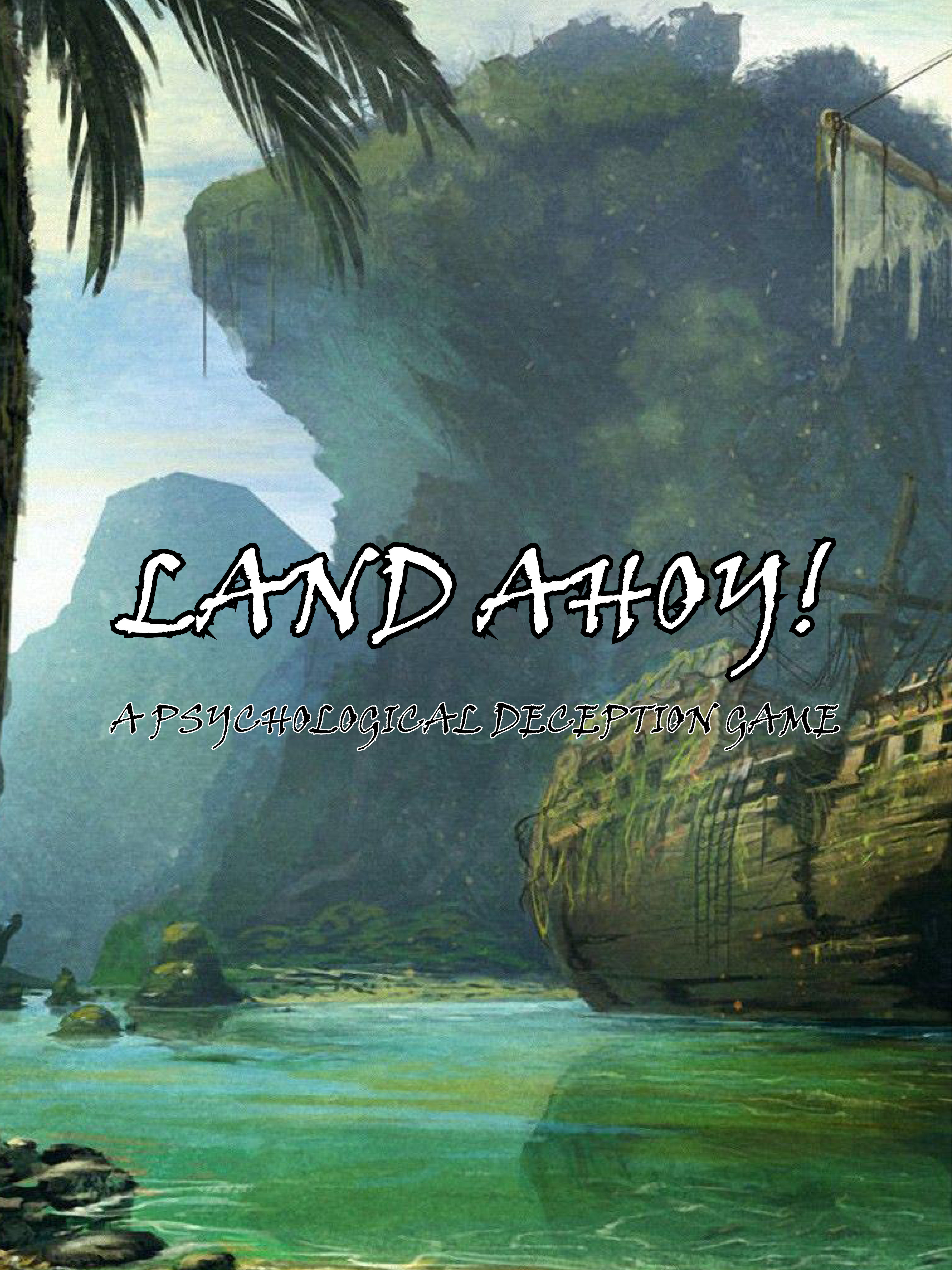
Land Ahoy!
This project's aim was to help reduce political polarisation by
encouraging young people to turn out to vote. This was a direct response to my research, looking into the effects social media has on political polarisation and how it is further marginalising already politically disconnected young people, allowing more radical voters to have a larger share of the vote.
I decided to make a boardgame that highlights the issues of not voting and the importance of political participation. This is because I needed a product that will bring young people together in becoming more politically involved, whilst being a fun experience and something that they’ll want to use. The idea being, to make a fun boardgame that young people want to play, whilst also having a serious underlining message throughout, hopefully leaving the user thinking about the importance of voting and the issues around political polarisation.